To chart the spread of the virus, the COVID-19 Genomics UK Consortium (COG-UK) – made up of the NHS, Public Health Agencies, academic and research institutions – is sequencing the SARS-CoV-2 virus from positive COVID-19 samples and sharing intelligence with hospitals, regional NHS centres and the Government.
I talked to Oliver Pybus, of the University of Oxford, a member of one of the many teams analysing the genetic code of the SARS-CoV-2 virus. His answers are in italics.
How many virus infections have you analysed?
As of 22 May, more than 20,000 viral genomes from positive COVID-19 cases had been sequenced in the UK, which is the largest number of COVID-19 genomes sequenced by any single country affected by the pandemic. Now the figure is nearly 30,000.
When did COVID-19 first arrive in the UK?
We know that in the week commencing Jan 27, 2020, the first two cases were diagnosed in York, and they were discussed in the media. But that is just a tiny fraction of what happened.
Our study gives us statistical insight into what happened and like all statistics they work well when there are big numbers.
So, our reconstructions of how the virus was introduced are most certain when we have got large numbers of people coming into the UK, large numbers of cases elsewhere, and a large number of virus genomes.
We found that UK epidemic emerged from a very large number of importations due to inbound international travel.
In all, we detected 1356 independent introductions as of 22 May. The rate peaked in mid-March and most introductions occurred during March 2020.
We also found that increasing rates and shifting source locations of SARS-CoV-2 importation were not fully captured by early contact tracing.
Which countries infected the UK?
Around one third of the 1356 introductions arrived via inbound travel from Spain, slightly over a quarter from France, around 14% from Italy, and around 23 per cent from other all other countries combined.
However, the relative contributions from each country changed a great deal over time.
Can you link the import of COVID from Spain to the 11 March matcH between Liverpool and Atlético Madrid?
We think that the relative contribution of imports due any one event will be trivial and it’s a distracting narrative. Photos in the news of people at a football match look arresting but they don’t capture the reality of the situation.
Until the beginning of March, the UK received around 1.75 million inbound travellers per week. This baseline rose by around ten percent at the end of the February half-term holidays.
The number of inbound passengers fell rapidly and continuously after 8 March, leading to a 95% reduction in inward international travel by the beginning of April.
While a few thousand football fans came in for one particular match, at the same time something like 20,000-30,000 inbound passengers were arriving every day in the UK, each from Spain and France – returning UK tourists, business travellers, weekend city breakers, second homeowners, students and so on.
What can analysis of the genetic code tell us about these 1300 plus introductions?
The UK government advised against all non-essential overseas travel on 17 March and advised British travellers overseas to return on 23 March.
But there was a period in mid-March when inbound travel to the UK was substantial and this coincided with high numbers of active cases elsewhere.
We think 1,300 plus introductions is an underestimate. We wish we had a better way to quantify how much an underestimate. We are working on that problem but we don’t yet have a solution.
We’ve sequenced genomes from around 1% of laboratory confirmed UK cases but that is not to say we have picked up 1% of introductions. The problem is akin to one in community ecology where you shake insects out of a few trees in a tropical rainforest and you try to infer the nature of the forest community.
Over the past few years, I and others have used a technique called phylogeography to track how viruses move around the world and what drives their spread. That means trying to reconstruct all of the movements just from the genetic data itself.
We take a set of genomes that are sampled at different times from different locations and we can draw a family tree of the virus, what we call a phylogenetic tree, from the genetic differences among the genomes. Because we know how fast these genetic differences accumulate, we can accurately reconstruct the timing of events in the tree.
On each branch of the tree we can see a movement from an ancestor at one point in time which is inferred to be at one location, to a descendant, in another location.
But phylogeography has not proved to be as helpful for SARS-CoV-2 as it has been for viruses like influenza, because there isn’t as much genetic variation among the SARS-CoV-2 genomes as we would like.
That’s partly because the outbreak is very recent and therefore there hasn’t been a great deal of time for the pandemic to accrue genetic diversity, and partly because coronaviruses evolve more slowly than viruses like influenza.
How much has the virus mutated?
There is not much variation among the virus genomes. However, overall, data are patchy.
While the UK has had this amazing project where we have generated nearly 30,000 genomes, more than 50% of the world’s genomes in an incredibly short amount of time, there are other countries that, even though they have had big outbreaks, haven’t many genomes, such as Italy and Germany.
So that means if we over represent the UK and under represent other locations, we are going to miss the location of where virus lineages came from, or have very strong bias.
To work out where a lineage of a virus came from, we used a different data source, notably the number of passengers coming into the UK from different countries on different days and the size of the outbreak in those locations.
There were a few introductions from China early on but then the number of travellers from China, and the number of cases there came down.
Whereas in Europe, there were large numbers of travellers entering the UK at same the time there were large outbreaks in several countries.
When you looked at the data, what struck you?
It came as a surprise that there were so many introductions from Spain because that wasn’t really covered in the media at all. Detailed individual contact tracing stopped in the UK on 12 March – at that point the outbreak was big in Italy.
By the time we started to see these really large numbers of introductions, both from Italy and from Spain and France and a range of other countries, we’d stopped recording that information by contract tracing, because there were too many cases in the UK to trace individually.
What else surprised you?
How rapidly the number of imports fluctuated rapidly, along with the dominant country from where they came. We went from a trickle to a flood and from being dominated by imports of virus from one country to switching quite quickly to imports from another country.
We hope that understanding that kind of dynamic can give a better idea of how to plan for future waves.
Which country was dominant at what time?
Very early on it was a handful of cases coming in from China, then Italy, then it switched to Spain. In mid-March, at the peak of the rate of importation, cases arrived from Spain, then France.
During March the range of countries that contributed imported cases increased, so smaller numbers from the Netherlands, from Germany, Belgium, the US, and so on.
France and Belgium became relatively more important later on because airline travel went down 95% but cross channel travel didn’t decline quite as much.
How has this changed our understanding of the epidemic at that time?
There was a discussion early in the epidemic about the UK being so many days behind other outbreaks. In hindsight, I wonder if that downplayed the fact that all the outbreaks in Europe were interlinked.
We are deeply connected across Europe by travel, the numbers of people moving between the large European countries is huge – it was a European outbreak.
The epidemics only became more independent when lockdown happened in each country. I am sure we have been a net exporter as well – this has been proven in the case of Iceland.
The UK’s epidemic didn’t just get seeded and then run its course entirely independently of what was happening in Spain and Italy and France.
Members of the Government’s Scientific Advisory Group for Emergencies (SAGE) have referred to the lack of ‘situational awareness’ in early March.
Prof John Edmunds of the London School of Hygiene & Tropical Medicine, said: ‘We were lacking information on a) the number of cases, b) the rate of increase, and c) the acceptability of social distance measures (this was probably largely unknowable at the time).
The COG-UK’s paper is very helpful at saying what was actually going on back in early March, which was a large increase in cases coming in from some of our nearest neighbours.’
In April, I talked to Kari Stefansson, whose genetic sequencing project revealed ‘the spread of the virus was much greater in the UK early on than people realised.’
Can you tell when the pandemic ultimately originated?
Despite recent reports, the huge volume of sequencing confirms the all COVID-19 cases worldwide share a recent common ancestor in China; all the viruses are very closely related.
Over and over again, the genetic estimates point to a common ancestor of the pandemic in late November, early December 2019.
Is there anything to support President Trump’s assertion it came from a Wuhan lab?
There is nothing to suggest that it was anything other than a natural event.
There is evidence that this virus is really good at jumping species. It has gone from humans into mink, from humans into cats and potentially into dogs and that’s all within the space of a couple of months.
So, this virus is obviously very well suited to jumping between different mammalian species.
Is there a way to check if COVID-19 been around longer?
There is no genetic evidence whatsoever that the virus has been hanging around. COVID-19 was picked up soon after it started spreading.
Influenza surveillance screening is done fairly routinely around the world so the obvious place to go looking for it is in the influenza screening archives from autumn 2019 – if you go back through those and look for COVID-19 positive samples there aren’t any before the outbreak began.
What do you make of claims the virus was DETECTED IN WASTE WATER in Barcelona, dating from March 2019?
Either our entire understanding of the epidemic history of SARSCoV2 is completely wrong, or this result is cross contamination or detection of a different coronavirus. I know which explanation my money is on.
Can you see super spreading events, which accelerated the pandemic?
There is an effort to create a database with every single cluster event and figure out the circumstances associated with super spreading events.
The best way to answer that question is through careful epidemiological studies – in terms of genomics, we are again limited by the slower evolutionary rate of the virus and because the strains are all quite similar.
Have you found evidence of new strains?
Our working hypothesis is that there isn’t a difference and it should require reasonably strong evidence to prove that there is.
There is one mutation, D614G, that is the strongest candidate at the moment for potentially having some functional role and it’s under intense study to see if it behaves differently in some way.
Why is D614G of interest?
This mutation affects the spike protein that the virus uses to enter human cells and the reason for the interest is that it has been observed to increase in frequency.
The key question is whether that increase is by accident, or because it really behaves differently. Yes, it might be of evolutionary importance but equally it could well turn out to be what we call a ‘founder effect’.
A ‘founder effect’ is the equivalent of what marketing gurus call the ‘first mover advantage’, where one product comes to dominate not because it’s better than its rivals but because it was first to reach the market.
In this case, it would suggest D614G is widespread because this mutant had been present in the viruses that founded this wave of infections, rather than the mutant had made the virus more infectious by allowing it to transmit more efficiently.
The pandemic is a big enough problem already!
So, if we find a strain with a 5% higher transmissibility, will that actually change our response to anything? Probably not – it won’t make much of a difference in terms of any kind of intervention or public health response.
How do you read the genetic code of the virus?
The genome sequences are read by two different British technologies: Illumina (originally Solexa, invented by Cambridge chemist Professor Sir Shankar Balasubramanian) and new arrival Oxford Nanopore which uses protein nanopores.
In nanopore sequencing changes in electrical current are detected as the virus’s genome passes through the nanopore, partially blocking it. The information about the change in current can be used to identify the detailed genetic sequence.
Oxford Nanopore technology has been used for Ebola virus, and in Brazil for Zika virus. Its advantage is that even small labs can generate meaningful amounts of genetic information.
At one end of the COVID-19 Genomics UK Consortium we have individual research labs with a portable devices (Oxford Nanopore’s MinION, which is far more compact than traditional lab based sequencers) generating 10s of genomes a week.
Then at the other end we have got the Wellcome Sanger Institute near Cambridge, which can potentially can do tens of thousands and is much more automated. Then there are labs in between that are partly automated with higher throughput sequencing machines.
In a hospital microbiology lab, we can get an idea of what the genome looks like in under an hour of actual sequencing time using the Oxford Nanopore approach. Whereas if a sample is going to a big lab like Sanger there are lag times in terms of shipping and processing and so on.

How are samples prepared?
Let’s say you have a blood or sputum sample, you extract the viral RNA first, convert it to DNA using reverse transcriptase and amplify the virus genome with a method called PCR.
Then we add chemicals to the genome – dongles on either end of the DNA molecule, if you like – to help pull it through the pore.
This also means you can run more than one virus genetic code on the same device at the same time in what is called multiplexing. Later, once the sequencing is finished you can work out which sequences came from which patient and stitch them all back together like a giant jigsaw puzzle.
Can you see the virus infection evolve in a patient?
There is only very preliminary data on this available and we would expect, based on our experiences of other viruses, that there is some variation.
Some people can be infected for quite a few weeks and we might expect more variation to accumulate in that time. Whether it has any clinical or epidemiological relevance, we don’t know.
How will this technique be used in future?
The analysis of viral genomes will play a greater role as the outbreak goes on because all the different strains in different locations start to become more distinct from each other. This isn’t because the mutation rate has increased, it’s just that there has just been more time for the virus to accumulate differences.
In Beijing, for example, they are now seeing reintroduction of the virus from places with high current rates of transmission, the Americas and Europe.
Later on, in the year, perhaps during a second wave, there will be better ability to discriminate source locations using virus genetic data.
How else will the data be used?
The data generated through COG-UK are used to provide virus status reports, including estimates of the reproduction number, at the level of regions or local authorities.
We can, for example, figure out the ‘detection lag’, which represents the length of time that a virus went undetected before it was first sampled by genome sequencing.
This detection lag has decreased through time as the cumulative number of UK virus genomes generated by the COG-UK project has increased.
We estimate that 80% of the importation events that give rise to detectable UK transmission lineages occurred between 28 February and 29 March 2020 (the remaining 20% of imports occurred before or after these dates).
Why did lineages become extinct?
Most likely as a result of the interventions such as social distancing that led to reductions in the numbers of new cases.
In early March the epidemic mostly comprised lineages that had been newly-detected for the first time, whilst by late April most transmission lineages had not been detected by genomic sampling for more than a week
What has it been like working on this project?
In terms of doing science, it has been fascinating. Almost every analysis method we used before we had to leave behind and invent new ones. We have never before had 30,000 virus genomes generated in just a few months.
When I did my PhD at the turn of the millennium, doing very simplified versions of what we are doing now, we were doing well if we had 30 virus genomes on a phylogenetic tree. Now we are on 30,000 in just three months!
How else can we track the pandemic?
Yale University researchers and colleagues in Hong Kong and China used mobile data for rapidly tracking population flows that could help policymakers worldwide more effectively assess risk of disease spread and allocate limited resources as they combat the COVID-19 pandemic.
I talked to co-author of the study Nicholas A. Christakis, Sterling Professor of Social and Natural Science at Yale University and Director of the Yale Institute for Network Science. His edited responses are in italics.
Why is tracking population flows important in the context of the outbreak of COVID-19 in China?
The pandemic first emerged in the city of Wuhan in the run-up to the Chinese Lunar New Year’s Eve on 24 January 2020, which is associated with the annual Chunyun mass migration.
This timing was really bad luck for our species, since this is the largest movement of human beings — who could carry the virus — that takes place each year. There are approximately three billion trips throughout the country during Chunyun.
And, in another unlucky coincidence, the virus leapt to our species in Wuhan which, for over a century, has been a central hub in China’s rail and aviation networks.
This also expanded the potential scale and range of the spread of the outbreak, which was particularly alarming given the severity of COVID-19.
How did you track the origins of the epidemic?
We use 11,478,484 counts of mobile phone data from individuals leaving or transiting through Wuhan between 1 January and 24 January 2020 as they moved to 296 prefectures throughout mainland China.
We linked this population-flow data, which was provided by a major national wireless telecommunications carrier, to COVID-19 infection counts, provided by the Chinese Center for Disease Control and Prevention (Chinese CDC), through 18 February.
For various reasons, we believe those counts are reliable, including some internal checks we were able to do with our data — namely that there was a correlation between the counts of movements obtained from one data source and the counts of cases obtained from another.
The onset of symptoms of the first recorded case of COVID-19 in Wuhan was 1 December 2019. By 19 February 2020 — the end of our study period — 74,576 infected cases had been verified in mainland China by the CDC.
What is different about your approach?
Rather than working back from hospital admissions and death rates, which reflect the reality of infections days if not weeks earlier, we used real-time data about population flows, such as phone use data and other big data sources that can accurately quantify the movement of people.
For example, by the end of the day on 24 January, we could observe that movement out of the city had almost completely ceased.
What kinds of things could you show using these data?
Our work shows that it is possible to accurately forecast the timing, intensity, and geographic distribution of the COVID-19 outbreak based on population movement alone.
First, we can document the efficacy of the quarantines established by the Chinese government in stopping the flow of the virus.
Technically, these were ‘cordons sanitaires’ since all members of a population were restricted, whether sick or well.
Second, we show that the distribution of population outflow from Wuhan accurately predicts the relative frequency and geographical distribution of infections across mainland China.
Third, we developed a mathematical model that uses population flow data not only to forecast the distribution of confirmed cases, but also to identify regions that have a high risk of transmission at an early stage.
In some ways this mathematical approach is the most fundamental contribution of our paper, because this model can be used, if suitable data are available, to identify risk sources with other epidemics, and also to provide for a real-time assessment of whether epidemic control manoeuvres are working to reduce community transmission of a pathogen, after its possible importation.
For completeness, we compared using our population movement data to other methods, such as the relative frequency of Baidu search engine queries for virus-related terms in each prefecture, or the distance from the origin of the epidemic (using what is called a gravity model), but these alternative methods were less effective at predicting spread.
Can this approach be used elsewhere?
Yes. The new model can be applied using any dataset that accurately captures people’s movements, such as train ticketing or car tolling data, meaning that policymakers worldwide could use it to inform efforts to contain the virus’ spread if data regarding population movements is available, especially if such data are available in near real-time.
The benefits of observing rather than estimating population movements are substantial as inaccurate predictions can have major consequences: under-reaction can result in disease spread and over-reaction can lead to inefficient policies — medically, socially, and economically.
In short, by accurately capturing population movements over time, we can predict how a contagion will spread geographically and use data-analytic techniques to help control it before a devastating epidemic erupts or re-erupts.
People spread contagious diseases when they move. Their movements are thus a harbinger of the future status of an epidemic.
HOW CAN I FIND OUT MORE?
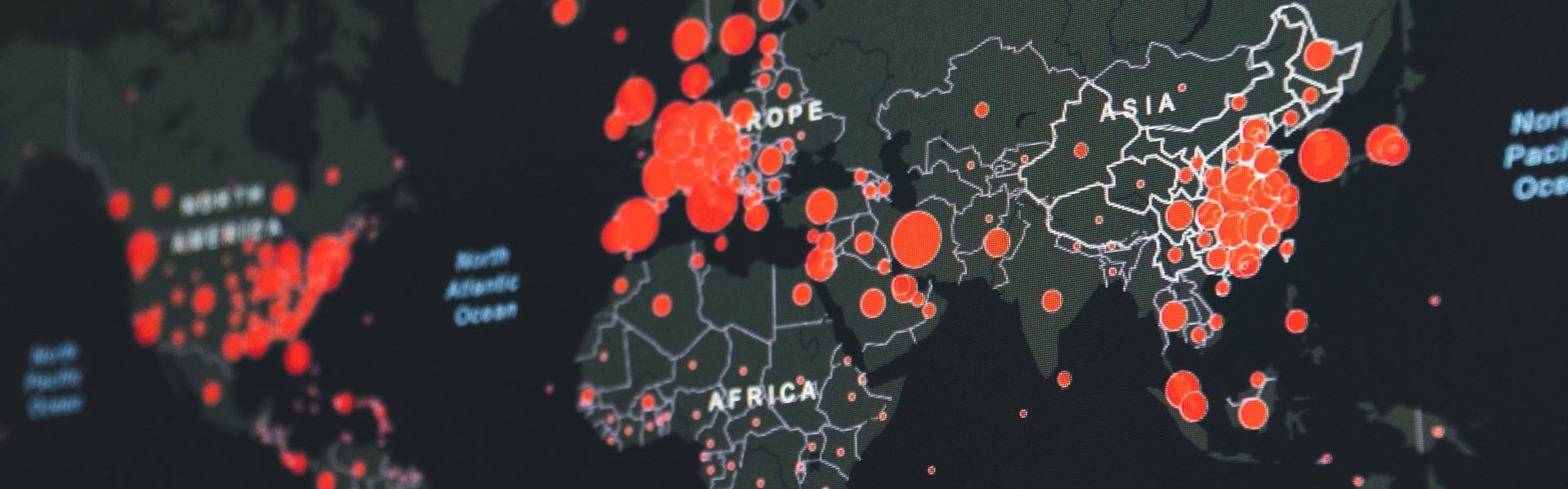
The latest picture of how far the pandemic has spread can be seen on the Johns Hopkins Coronavirus Resource Center or Robert Koch-Institute.
You can check the number of UK COVID-19 lab-confirmed cases and deaths along with figures from the Office of National Statistics.
There is more information in my earlier blog posts (including in German by focusTerra, ETH Zürich, with additional information on Switzerland), from the UKRI, the EU, US Centers for Disease Control, WHO, on this COVID-19 portal and Our World in Data.
The Science Museum Group is collecting objects and ephemera to document this health emergency for future generations.