As part of our ambitious project to share more of the collection, we’ve been working on a series of stories about the intriguing and unexpected ways chemistry affects the world around us.
We asked illustrator Jen Haugan to tell us more about the process of marrying art and science in her new illustrations.
Can you tell us a little bit about your background as an illustrator? Have you always had an interest in science or was this project something new?
I’ve always had an interest in science, but this runs in the family (my dad even worked at CERN for a short while in his early career). I began my career in animation, as I was fascinated with the technical aspects of the craft.
I’ve always tried to find a balance between my technical and creative side, so I was really excited when this commission came along, as it seemed a perfect fit!
Had you come across the Festival Pattern Group designs before? What were your first impressions?
I’d actually never come across the designs before, though growing up in Norway, the Festival of Britain was also an unknown to me. I was really impressed by the boldness and intricacy of some of the designs—the haemoglobin patterns in particular.
Some of the colour choices were fairly reserved and muted (it’s interesting to see how they reflect the tastes of the early 50s), while others were really daring and full of contrast.
The original designers had some interesting discussions with crystallographers such as Helen Megaw about the need for scientific accuracy, and how this competed with creating beautiful designs. What was your approach to interpreting the molecules?
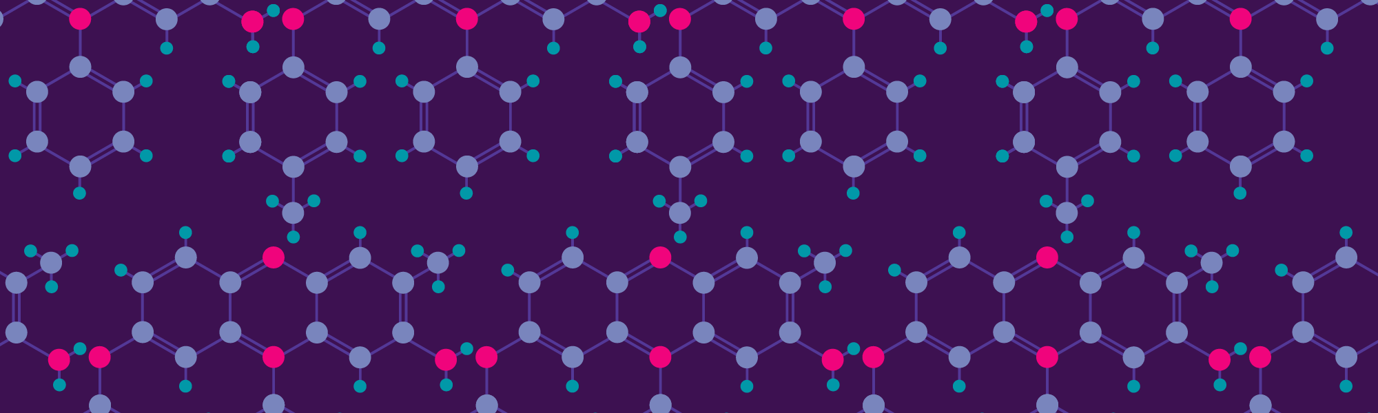
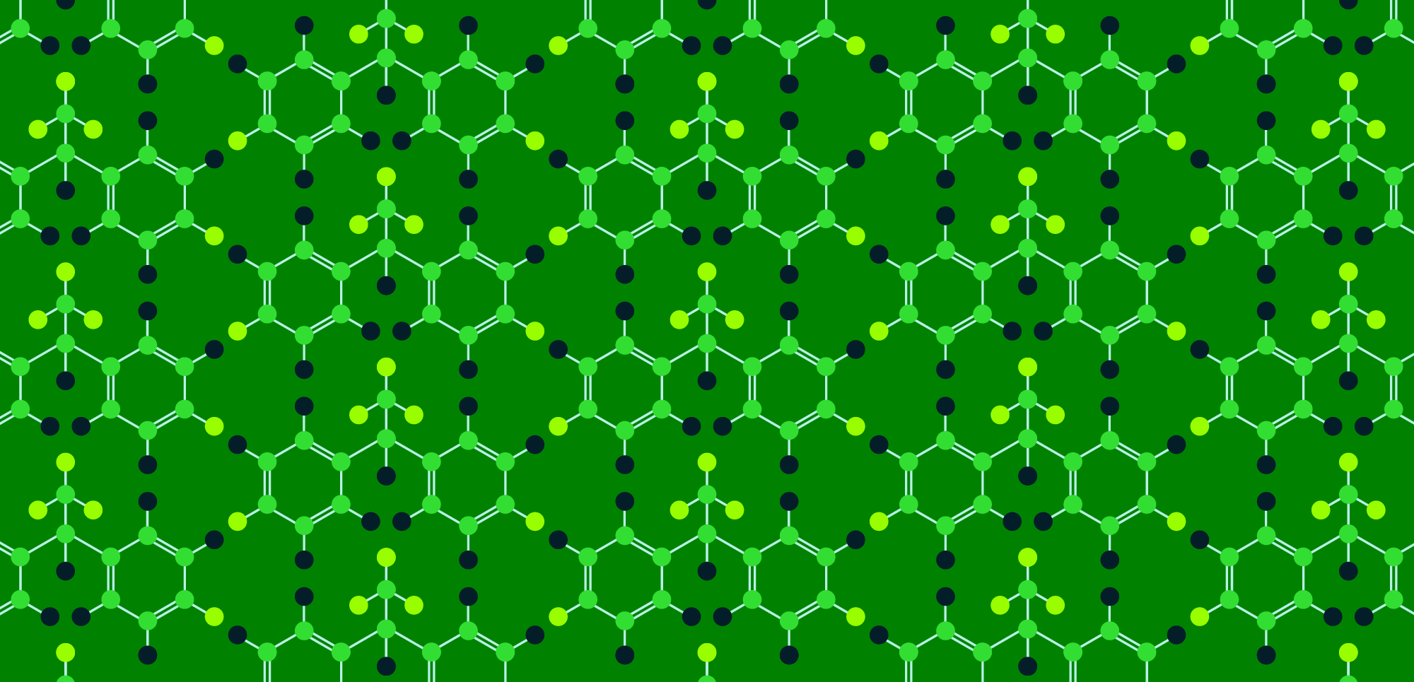
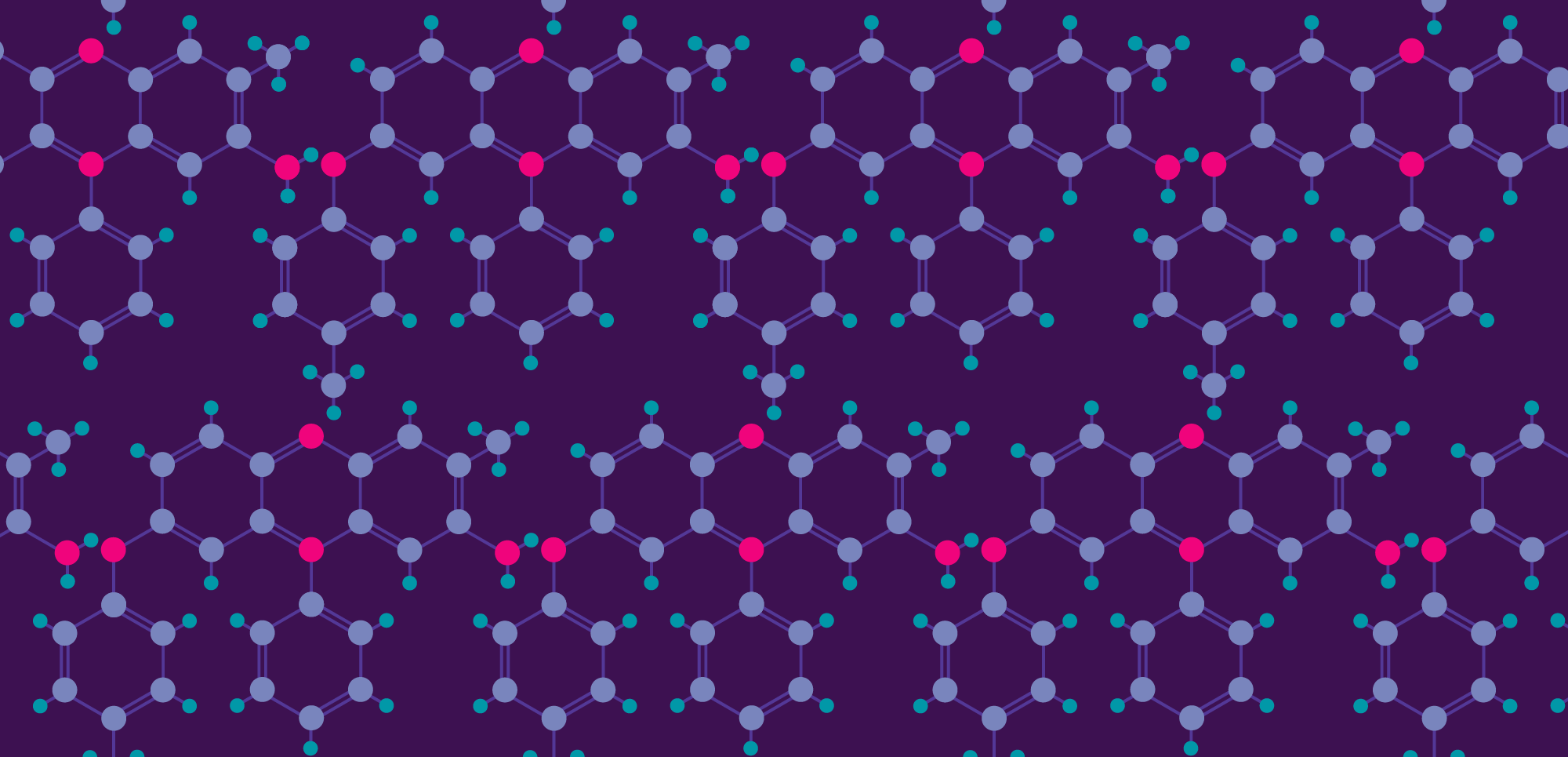
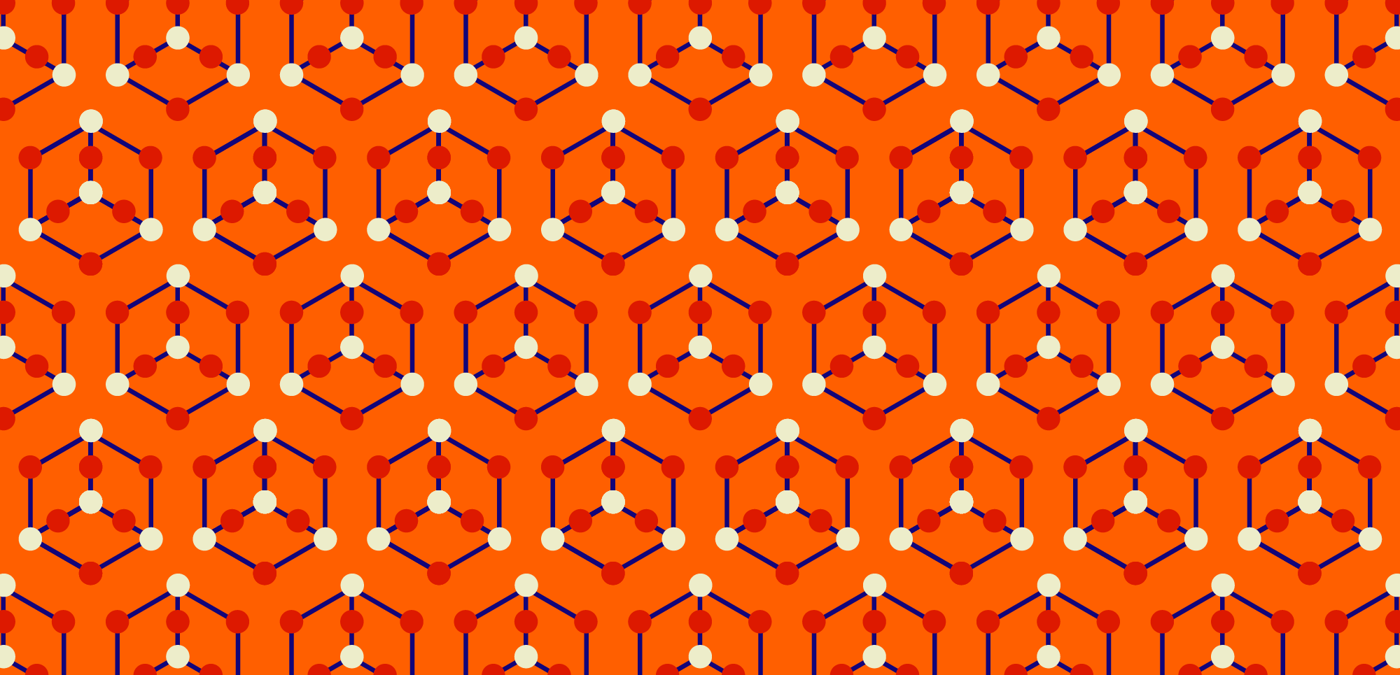
My starting point for each molecule (with the exception of the designs for penicillin and for the periodic spiral, which are based on objects) was studying diagrams of its molecular structure, and drawing this out as accurately as possible, using specific colours for each atom.
I then started combining sets of molecules into different patterns, keeping an eye on the placement of the molecule and the negative space between the sets. For some of the molecules I’ve been a little bit flexible with the accuracy of their bonding angles, adjusting things slightly if it makes a neater pattern.
I’ve aimed to be as true as I can be to the molecule itself, but then placed the molecules together in ways that make the pattern as interesting as possible.
And despite the discussions on scientific accuracy, the FPG patterns seem to have been a perfect merger between art and science. It would be nice to see more similar initiatives pop up today – I’m definitely an advocate for having STEAM rather than just STEM in schools, and perhaps the success of the FPG is one great example of why that’s so relevant.
Have you learned anything interesting or surprising while researching and creating the designs?
Absolutely! I think one of the strangest and most fascinating stories I came across was about the benzene molecule, and how its structure had remained an inexplicable mystery until the German chemist August Kekulé had a vivid dream of a snake biting its own tail – leading him to theorise that the structure of benzene was ring-shaped.
A lot of discoveries (such as Perkin’s mauveine) have seemed purely happenstance, which I think emphasises just how important experimentation is to science. Nowadays, funded research seems to be far more rigid and aimed at only confirming or quashing existing hypotheses, so it’s a pleasure to read about the wild experiments from the past couple of centuries.
I was also really pleased to learn how so many of the UK’s leading crystallographers were female, including Helen Megaw, who was the scientific consultant for the FPG, and Dorothy Hodgkin, who became the third female to be awarded the Nobel Prize for chemistry.
Do you have a favourite design – of yours, and from the FPG patterns?
I’m always very biased towards bold, bright colours, so I think the arsenic trioxide pattern is one that works really well as it pops out from the page. I also like the design for the story on the modern periodic table, based on de Chancourtois’ periodic spiral, as it’s not something instantly recognisable. I hope people will see it and wonder what it is in relation to the periodic table, and then click through and read about it.
As well as the haemoglobin patterns by the FPG, there are a couple of particularly great designs based on the structure of insulin – the navy/red and dark purple/yellow colour varieties of these are really striking.
How would you sum up your thoughts from the design process?
With today’s digital tools, the iterative process is so much faster, so I’ve had a big advantage compared to when the Festival Pattern Group’s designs were produced, in terms of quickly testing colour variations and different pattern options.
There’s certainly a lot of beauty in molecular structures, so I hope that anyone who sees the designs will be intrigued enough to read through and explore the FPG designs, as well as reading about the very significant work of Britain’s early crystallographers.
Delve into interesting stories of how chemistry affects the world around you in our online series.